5.18.2009

Video- The Power To Transform: The Transformation 2001-2008


This video was used as a closing piece for The Power To Transform Capital Campaign at Gannon University. The purpose was to highlight the transformation of the University accomplished by the funds from the campaign. The piece was unveiled at the closing ceremony for the Campaign, distributed to donors on DVD media, and published/advertised on YouTube. I selected the music from a stock selection, shot many of the photographs during other protects at the University, and provided Art Direction for the videography.

Tools: Digital Photography, Digital Video, Adobe Premiere CS3, Adobe Encore CS3

3.18.2008

Self Promotion - Andrew Lapiska/iDesign


This brand was created to advance my professional appearance. The brand is carried out through logo, letterhead, business card and other materials. The large "i" design is a cutout in production creating a window for elements to show through.
Tools: InDesign CS3, Illustrator CS3

Sell Sheets - Gannon University Factsheets


2008 Erie Ad Club ADDY Winner, Gold

These items were created in conjunction with the Office of Admissions of the University to be distributed to prospective high school students. The marketing was directed by SAT questioners. Each packet included a wrap-around half cover, an introductory sheet based on anticipated field of study, followed by specific sheets for each major within the students general fiend of interest. The design was a huge turn-around from those used in the past and was hoped to better serve the target demographic with an active and colorful design. The handwriting was incorporated throughout asking the student to "fill in the blanks."
Tools: InDesign CS3, Photoshop CS3, Illustrator CS3

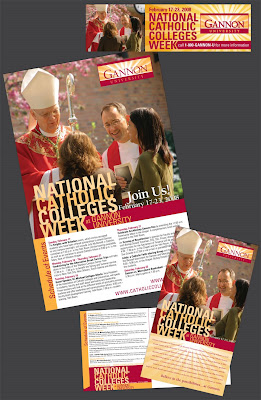
Collateral - National Catholic Colleges Week


These items were created to advertise Gannon's participation in National Catholic Colleges Week. The collateral included posters, postcards, and a billboard design. Repetition of images and typesetting were used to reinforce the event as a brand within the overall brand of the University.
Tools: InDesign CS3, Photoshop CS3, Illustrator CS3

Mailer - Gannon University Spring Open House


These pieces were created to alert prospective students to an upcoming Open House at Gannon University. A self mailer/reply was used for the main invite and an oversized postcard was also mailed to specific individuals. These pieces also reinforced the brand of the University through use of type, wordmark, and copy.
Tools: InDesign CS3, Photoshop CS3

Book Design - Best Management Practices for Erie Bluff Landowners


2008 Erie Ad Club ADDY Winner, Gold
2008 Erie Ad Club ADDY Winner, Student Best of Show

This book was designed under the supervision of the Mercyhurst College Biology Department in association with funding by the Department of Environmental Protection. Created for distribution to Erie Bluff Landowners, it had to be both informative and attractive to increase awareness about a growing environmental problem. My responsibilities included organization, layout and photography for the entire book.
Tools: InDesign CS3, Photoshop CS3, Illustrator CS3
Illustrations: Jodi Hopper

3.17.2008

Poster Design - Poetry Awards Nights


This package was designed to advertise an annual English Departmental Awards Night. A simplified color palate was used to reduce printing costs. The active and fresh look of the poster was conceived to attract a larger crowd to an event that might otherwise be preconceived as unexciting.
Tools: Photoshop CS3, Illustrator CS3, InDesign CS3

Logo Design - College Admissions in the Media


This logo and stationary package was designed for an presentation to a board of college admission representatives. The presentation focused on the place of college admissions in traditional and new media. The color palate was created from the combined colors of the universities jointly presenting. The notepads served as a promotional take-away for attendees.
Tools: InDesign CS3, Illustrator CS3

Promotional Design - Erie Ad Club "007 Season"


This piece was designed as a fold-out mailer to advertise events during the Erie Ad Club's 2007-2008 season. Combining the requested James Bond theme with their existing rooster logo, ChickenFinger was conceived.
Tools: InDesign CS3, Illustrator CS3

Corporate Identity/Stationary - Shampoodles


An identity and stationary package created for a self-serve dog washing location in upper-class neighborhoods. The colors and simple images were designed to appeal to the senses leaving an iconic impression on the viewer. The package pictured includes: letterhead, business card, custom envelope, and website landing page.
Tools: Photoshop CS2, Illustrator CS2, Dreamweaver CS2, InDesign CS2
Creative Assistance: Sara Wierziba

Poster Design - Dining Room


This poster was produced to advertise a student theatrical production. The poster follows a color scheme of the 1970's setting of the play. The poster is modeled after a Sall Bass design.
Tools: Illustrator CS2

Brochure Design - Gannon University Press


Used as an internal promotional piece, this brochure highlights services, prices, and staff of the Gannon University Press. The colors were chosen to make the connection to four-color process printing and the repetition represents the duplication process.
Tools: Photoshop CS3, InDesign CS3

Postcard Design - Senior Thesis Show 2007


This postcard was designed to play off the popular series of iPod commercials. Alluding to the artwork contained within the show, the actual silhouettes of each participant are used to make a personal connection and include outlines of their specific design tools for the chosen medium.
Tools: Photoshop CS2, Illustrator CS2, InDesign CS2

Poster Design - Twelfth Night


This poster was created to advertise a student production of William Shakespeare's Twelfth Night. The images were altered to conceal the identity of the performers to tone down the racy piece for a school setting. The striking images were used to grasp the attention of college students while keep them curious for more.
Tools: Photoshop CS2

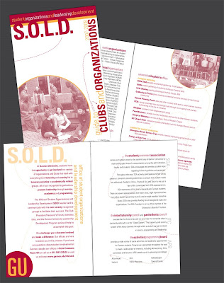
Brochure Design - SOLD


This piece was created for the Office of Student Organizations and Leadership Development to illustrate offerings of various programs and groups across campus. This piece had to appeal to prospective and current students and give am exciting look to the activities.
Tools: InDesign CS2, Photoshop CS2 

Ad Spot - VoMo


This ad is designed for placement in an upscale wine and food publication to promote a upper-class restaurant catering to discerning palates serving only the finest organic foods. The use of color and imagery is an extension of the established brand.
Tools: InDesign Cs2, Photoshop CS2

Pamphlet Design - What's New for You! @ GU


A yearly mailing to announce new additions to campus, this piece served as a means of communication between university administration and students. The active look of the piece was used to peak interest and break up the long list of bulleted text while still maintaining strong branding of the University.
Tools: InDesign CS2

Gallery Promotion - NPAA Exhibit


This poster and postcard collateral package was designed for a traveling exhibit of the Northwestern Pennsylvania Artist Association. I incorporated their logo using a list of members as the background. Incorporating the bright CMY dots as separators drew attention to the piece while the tight tracking of the names made the viewer look closer.
Tools: InDesign CS2

Invitation Design- New Year's Eve 2008


Designed to have a modern look with a touch of class. This invitation was printed on translucent paper attached to a black backing sheet.
Tools: InDesign CS3, Illustrator CS3

Pamphlet Design - Metz @ Home


A simple half fold brochure to highlight new offerings of a foodservice company. The colors were chosen to stand out with contrast in a maroon and gold world.
Tools: InDesign CS3, Photoshop CS3

11.14.2005

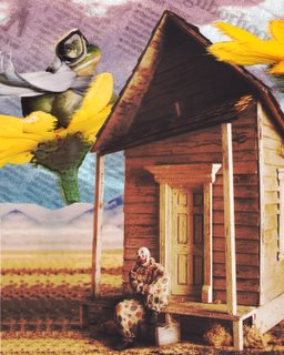
Digital Image- Frogs With Scarves Are Happier Than Clowns With Shacks


This project started out as a simple exercise in Photoshop, but turned into something that I truly liked. The saturated colors and surreal nature of this piece were inspired by the film "What Dreams May Come" and the Peter Gabriel music video "Sledgehammer".
Tools: Adobe Photoshop CS

T-Shirt Design- Earth Day 2005


I created this t-shirt as the participation gift for a lakeside clean-up project taking part in the community. It was selected from numerous entries to be printed and handed out on Earth Day to all who were a part of the annual clean-up effort.
Tools: Adobe InDesign CS

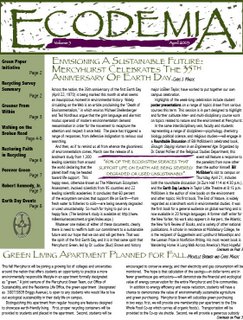
Newsletter Design- Ecodemia


This newsletter designed served to replace an old, worn, Microsoft Word-designed newsletter for an environmental organization. I attempted to maintain an earthy feel and color palette while still making it modernly appealing. My design was chosen by the organization to be produced and distributed throughout the community.
Tools: Adobe InDesign CS, Adobe Photoshop CS

Poster Design- SafeNet


2006 Erie Ad Club ADDY Winner, Gold

This poster was created for SafeNet Erie, a non-profit organization, to promote a new cab service available to disabled persons of Erie County. Before the introduction of this service, persons with physical disabilities often found themselves stuck within the confines of their home and perhaps being subjected to abuse by their caretakers. The poster was selected by SafeNet from an array of entries to be printed and posted around town to advertise and promote this new service. This design was also selected as the recipient of a Silver Addy Award in 2006 by the Erie, PA chapter of the American Advertising Foundation and went on to the regional competition.
Tools: Adobe Photoshop CS

Logo Design- Resolution Records


I designed this logo for a colleague to brand a record company that she was creating. I wanted to create something that was powerful and nostalgic at the same time.
Tools: Adobe InDesign CS

Logo Design- Artisan Lounge


This logo was designed for a fictional company of my own creation. I first conceived the project to brand a chair manufacturing company, but as the project progressed it turned into something else. I began to envision the Artisan lounge as a neighborhood coffeehouse where people could meet and discuss literature, poetry, and artwork.
Tools: Adobe InDesign CS, Macromedia Freehand 10